top of page
DEVDATT MANJREKAR
The Empire
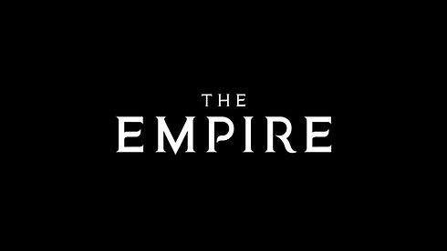
The brief for the logo was to keep it simple and elegant but yet powerful.�� The small sharp serif stem of the type says how powerful and strong the pillars are and the curvy tails and crossbar of E M P R gets the elegant part of it which makes it a complete logo.


bottom of page